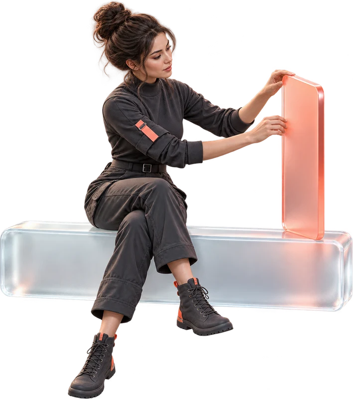
Components
Reusable variants, states and shared styles.
UI/UX design/ 01
We design websites and apps that make it clear what people can do and how to get there.
Let’s discuss your projectSee how we build it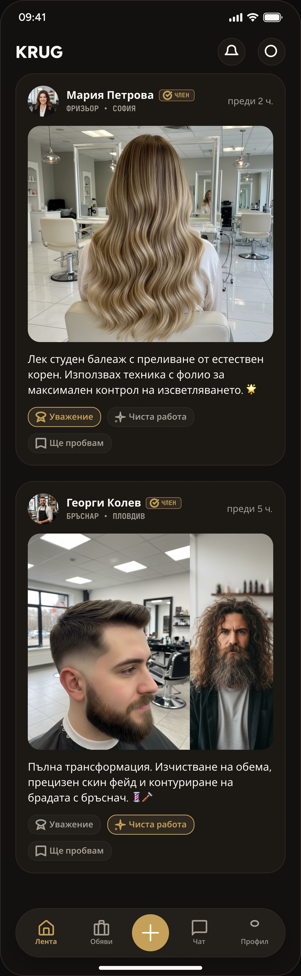
INSIDE THE WORKSHOP
We review the current product, customer conversations and available data. We map tasks and points of hesitation to decide which screens are needed and how they connect.
FROM THE IDEA TO THE DETAILS
For a new product or an existing interface that needs a clearer structure and a character of its own.
We organise content, screens and steps around the tasks people actually need to complete.
We connect the key screens so you can try the idea before development begins.
We create typography, colours and components that express your brand’s character.
We define behaviour, mobile layouts and interface states - from empty screens to errors.
A CLEAR OUTCOME
We agree on features, timing and scope before starting. Support and future releases are arranged for each project.
HOW WE WORK TOGETHER
Understand the people and their tasks.
Structure, design and prototype.
Review together and prepare for code.
UNDER THE SURFACE
Reusable variants, states and shared styles.
Contrast, focus, control sizes and a logical navigation order.
Figma files and guidance for adapting between screen sizes.
Bring your brand, example user tasks and access to the product if one already exists.
BEFORE WE START
Yes. We prepare the prototype, components and interaction notes so your team can continue with development.
Yes. We work with your current logo, colours and character. If the identity needs to change, we agree on that separately before starting.
We first agree on the structure and visual direction. You then review a clickable prototype and share feedback. The stages and revision rounds are part of the agreed scope.