 WWW
 EN
 BG

In a good physical shop, a salesperson lets you feel the fabric, warns you that the jeans run small and mentions that delivery is free if you add one more thing. Online, the product page has to do all of that alone, for every visitor, at three in the morning, without seeing anyone’s face. Most product pages do it like a sleepy intern on day one: one photo from the supplier, a pasted list of specs and a button. Here’s how to hire a better salesperson.
Photos do the touching
Shoppers can’t pick the product up, so your photos have to stand in for their hands. A solid set includes a clean main shot on a plain background, a few angles, a close-up of the detail that matters (stitching, texture, the ports on the side), the product in use and something that shows scale: in a hand, on a person, next to an object everyone knows. If the product comes in colours, every colour gets its own photo. Nobody trusts a tiny coloured circle to explain what “sage green” looks like.
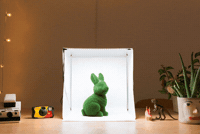
Supplier photos are a start, not a finish. The same images sit on every other store selling that product, so they give no one a reason to pick you. You don’t need a studio to do better: a small light box, a phone, daylight from a window and a bit of patience go a long way. Shoot a short video too, even a few seconds of someone turning the product in their hands. Then export everything at sensible sizes, so your beautiful photos don’t turn the page into a waiting room.
Copy that answers instead of decorating
Start with one or two sentences about what the product does for the person reading, then make the details easy to scan: size, materials, what’s in the box, compatibility, care instructions. “High-quality backpack” tells me nothing. “Fits a 15-inch laptop and a lunch box, and the bottom is waterproof, so you can put it down on a wet tram floor” tells me everything, and it sounds like someone who has actually used it.
Your inbox is the best copywriting brief you’ll ever get. Every question customers ask more than once (“Is it dishwasher safe?”, “Does it come with a charger?”, “Will it fit a small balcony?”) is a sentence missing from the product page. Add those answers, and you’ll sell more while answering fewer emails. Also skip the manufacturer’s description pasted word for word: it already lives on plenty of other sites, it rarely helps your search rankings, and it was written for distributors, not for people.
Reviews: let other people do the bragging
Nothing convinces a hesitant shopper like someone who already bought the thing. Ask for a review a few days after delivery with one short email and one big button. Show the star rating near the title and price, not only at the very bottom, and let customers add photos, because a slightly blurry photo from a real kitchen beats any studio shot for credibility.
Don’t hide the imperfect reviews. A page with nothing but five stars looks staged, while a three-star review that says “lovely, but order a size up” actually helps the next person choose correctly, and that means fewer returns. Never write reviews yourself or pay for fake ones: apart from being dishonest, EU consumer rules explicitly ban it. Add product structured data to the page as well, so search engines can understand what the product is, what it costs and how it’s rated.
Show the price like you mean it
The price should be big, close to the product name and the button, and final, with VAT already included. If something is on sale, a crossed-out old price is fine, as long as it’s real. In the EU the “before” price in a discount has to be the lowest price you charged in the previous 30 days, so the old trick of raising prices a week before a sale and then “discounting” them is both risky and easy to spot.
Help people feel good about the number. Show the price per unit for multipacks, offer a bundle when products naturally go together and mention payment by instalments if you offer it. And if your product costs more than the one on the big marketplace, say why, right there: longer warranty, better materials, local support, faster delivery. A higher price with a reason is a choice. A higher price without one is a tab the visitor closes.
Delivery and stock, right under the button
Three questions sit in every shopper’s head next to the buy button: is it in stock, when will it arrive and can I send it back? Answer all three in three short lines directly under the button, with an icon each if you like. “In stock, ships tomorrow, free returns” does more selling than a paragraph of adjectives. Keep stock status honest: “only a few left” is useful when it’s true and poisonous when it isn’t, and fake countdown timers belong in escape rooms, not in stores.
Built for thumbs
Most of your visitors will see the product page on a phone, so design it for a thumb. Keep the add to cart button visible without hunting for it, for example in a bar that sticks to the bottom of the screen. Make size and colour selectors big enough to tap without zooming, and keep the size guide one tap away instead of inside a PDF. Below the main details, suggest one or two things that genuinely go with the product rather than a carousel of twenty random items.
To know which pages to fix first, compare product views with add to cart events in GA4. Products with lots of views and few adds are your rewrite list, because the interest is clearly there and the page is letting it slip. Start with your three most visited products, give them the full treatment and watch what happens.
And if you’d like experienced eyes on it, write to us with links to the products you care about most. We’ll tell you what each page forgets to say, which photos are missing and where the button is hiding from your customers.



 We reply within 24 hours on business days.
 Two sentences are enough. We ask the rest.
 A human writes back. No newsletter you didn’t ask for.